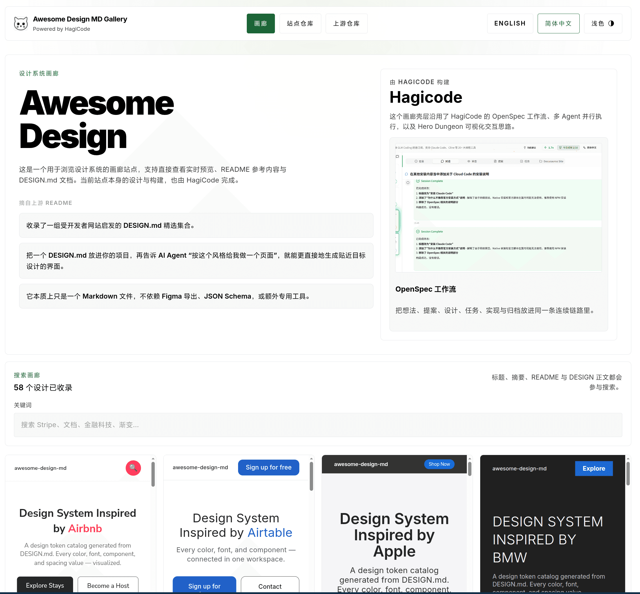
Guide to Creating a Border Light Sweep Animation Effect
Guide to Creating a Border Light Sweep Animation Effect
Section titled “Guide to Creating a Border Light Sweep Animation Effect”How do you build that important element users notice at a glance using pure CSS? It is actually not that hard. The trick is just taking a slightly roundabout path. In this article, I will walk you through how to build a border light sweep animation from scratch, and also share a few of the pitfalls we ran into while building HagiCode.
Background
Section titled “Background”If you work on the frontend, you have probably had this experience before: a product manager walks over with that “this is definitely simple” expression and says, “Can we add some kind of special effect to this running task so users can spot it immediately?”
You say sure, we can just change the border color. Then they shake their head with that look that says, “You do not get it.” They reply, “That is not obvious enough. I want the kind of effect where light runs around the border, like in a sci-fi movie.”
At that point you might start wondering how to build it. Canvas? SVG? Or can CSS handle it on its own? After all, nobody wants to admit they do not know how.
In modern web applications, border light sweep animations are actually very common. They are mainly used in a few scenarios like these:
- Status indicators: Marking tasks in progress or active items
- Visual focus: Highlighting important content areas
- Brand enhancement: Creating a sleek, modern, tech-forward visual style
- Seasonal themes: Building a celebratory atmosphere for special occasions
We ran into exactly this requirement while building HagiCode. Users needed to see at a glance which sessions were running and which proposals were currently being processed. We tried several different approaches. Some paths were smoother, some were a bit more winding. In the end, we settled on a fairly mature implementation strategy.
About HagiCode
Section titled “About HagiCode”The approach shared in this article comes from our hands-on experience in the HagiCode project. HagiCode is an AI-driven coding assistant project, and the interface makes extensive use of border light animations to indicate different runtime states. Examples include the running state of items in the session list, status transitions in the proposal flow diagram, and intensity indicators for throughput.
These effects are not especially complicated in principle, but we definitely ran into plenty of pitfalls while implementing them. If you want to see the real thing, you can visit our GitHub repository or head to the official website. In the end, what matters most is what actually works.
Core Implementation Ideas
Section titled “Core Implementation Ideas”After analyzing the HagiCode codebase, we summarized several core implementation patterns below. Each one fits a different scenario, or in other words, each one exists for a reason.
1. Rotating glow with a conic gradient (most common)
Section titled “1. Rotating glow with a conic gradient (most common)”This is the classic way to implement a border light sweep effect. The core idea is to use CSS conic-gradient to create a conic gradient, then rotate it continuously. Like a streetlight turning in the night, it just keeps circling.
Key elements:
- Use the
::beforepseudo-element to create the glow layer - Use
conic-gradientto define the gradient color distribution - Use the
::afterpseudo-element to mask the center area (optional) - Use
@keyframesto implement the rotation animation
2. Side glow line
Section titled “2. Side glow line”This works well for status indicators in list items. You create a thin glowing line on one side of the element instead of animating the entire border. Sometimes a little light is enough. You do not need to illuminate the whole world.
Key elements:
- A thin absolutely positioned line element
- Use
box-shadowto create the glow effect - Use
scaleandopacityfor a breathing animation
3. Glowing background with box-shadow
Section titled “3. Glowing background with box-shadow”If you do not need the full sweep effect and just want a soft background glow, layering multiple box-shadow values is enough. Sometimes the simpler option is the better one.
4. Accessibility support
Section titled “4. Accessibility support”This part is easy to overlook, but it is extremely important. Every animation should account for the prefers-reduced-motion media query and provide a static alternative for users who do not want animation. Not everyone enjoys constant motion, and respecting that preference matters.
Implementation Options
Section titled “Implementation Options”Option 1: Rotating conic-gradient border (recommended)
Section titled “Option 1: Rotating conic-gradient border (recommended)”This is the most complete implementation of the sweeping border light effect, and it is also the option we use most often in HagiCode. After all, if something works well, why replace it?
/* Parent container */.glow-border-container {  position: relative;  overflow: hidden;}
/* Rotating glow layer */.glow-border-container::before {  content: '';  position: absolute;  top: -50%;  left: -50%;  width: 200%;  height: 200%;  background: conic-gradient(    transparent 0deg,    rgba(59, 130, 246, 0.6) 60deg,    rgba(59, 130, 246, 0.3) 120deg,    rgba(59, 130, 246, 0.6) 180deg,    transparent 240deg  );  animation: border-rotate 3s linear infinite;  z-index: -1;}
/* Mask layer (optional, for creating a hollow border effect) */.glow-border-container::after {  content: '';  position: absolute;  inset: 2px;  background: inherit;  border-radius: inherit;  z-index: -1;}
@keyframes border-rotate {  from {    transform: rotate(0deg);  }  to {    transform: rotate(360deg);  }}
The principle behind this option is fairly simple: create a pseudo-element larger than the parent container, draw a conic gradient on it, and rotate it continuously. The parent container uses overflow: hidden, so only the light passing around the border remains visible. It is a bit like watching a streetlight through a window. You only ever see the small slice that passes by.
Option 2: Simplified rotating light border
Section titled “Option 2: Simplified rotating light border”If you do not need the full effect, HagiCode also includes a lighter utility-class version. Sometimes the simpler approach really is better.
/* Rotating light border utility class */.running-light-border {  position: absolute;  inset: -2px;  background: conic-gradient(    from 0deg,    transparent 0deg 270deg,    var(--theme-running-color) 270deg 360deg  );  border-radius: inherit;  animation: lightRayRotate 3s linear infinite;  will-change: transform;  z-index: 0;}
@keyframes lightRayRotate {  from {    transform: rotate(0deg);  }  to {    transform: rotate(360deg);  }}
/* Accessibility support */@media (prefers-reduced-motion: reduce) {  .running-light-border {    animation: none;  }}
Notice the will-change: transform here. It tells the browser, “This element is going to keep changing,” so the browser can prepare some optimizations ahead of time and keep the animation smoother. Preparing in advance is usually better than scrambling at the last minute.
Option 3: Side glow line
Section titled “Option 3: Side glow line”This is especially suitable for list-item status indicators, and it is exactly what the HagiCode session list uses. One thin line can still stand out among many items. That feels like a life lesson in its own way.
.side-glow {  position: relative;  isolation: isolate;}
.side-glow::before {  content: '';  position: absolute;  left: 0;  top: 14px;  bottom: 14px;  width: 1px;  border-radius: 999px;  background: var(--theme-running-color);  box-shadow:    0 0 16px var(--theme-running-color),    0 0 28px var(--theme-running-color);  z-index: 1;  pointer-events: none;  animation: sidePulse 2.6s ease-in-out infinite;}
.side-glow > * {  position: relative;  z-index: 2;}
@keyframes sidePulse {  0%, 100% {    opacity: 0.55;    transform: scaleY(0.96);  }  50% {    opacity: 0.95;    transform: scaleY(1);  }}
This uses isolation: isolate to create a new stacking context, then relies on z-index to control the display order of each layer. pointer-events: none is also essential. Otherwise the pseudo-element would block user clicks. Some things can look nice, but they still should not get in the way.
Option 4: Wrap it in a React component
Section titled “Option 4: Wrap it in a React component”If your project uses React, you can wrap this logic in a component, especially the accessibility handling. Write it once, use it many times. That is the whole point.
import React from 'react';import { useReducedMotion } from 'framer-motion';import styles from './GlowBorder.module.css';
interface GlowBorderProps {  isActive: boolean;  children: React.ReactNode;  className?: string;}
export const GlowBorder = React.memo<GlowBorderProps>(  ({ isActive, children, className = '' }) => {    const prefersReducedMotion = useReducedMotion();
    if (!isActive) {      return <div className={className}>{children}</div>;    }
    if (prefersReducedMotion) {      return (        <div className={`${styles.glowStatic} ${className}`}>          {children}        </div>      );    }
    return (      <div className={`${styles.glowAnimated} ${className}`}>        {children}      </div>    );  });
The matching CSS module:
/* Animated version */.glowAnimated {  position: relative;  overflow: hidden;}
.glowAnimated::before {  content: '';  position: absolute;  top: -50%;  left: -50%;  width: 200%;  height: 200%;  background: conic-gradient(    from 0deg,    transparent,    rgba(59, 130, 246, 0.6),    transparent,    rgba(59, 130, 246, 0.6),    transparent  );  animation: rotateGlow 3s linear infinite;  z-index: -1;}
.glowAnimated::after {  content: '';  position: absolute;  inset: 2px;  background: inherit;  border-radius: inherit;  z-index: -1;}
/* Static version (accessibility) */.glowStatic {  position: relative;  border: 1px solid rgba(59, 130, 246, 0.5);  box-shadow: 0 0 15px rgba(59, 130, 246, 0.3);}
@keyframes rotateGlow {  from {    transform: rotate(0deg);  }  to {    transform: rotate(360deg);  }}
The useReducedMotion hook from framer-motion automatically detects the user’s system preference. If the user has enabled reduced motion, it returns true, and the component shows the static version instead. Respecting the user’s preference matters more than forcing a flashy effect.
Practical Lessons Learned
Section titled “Practical Lessons Learned”These are some of the lessons we learned while building HagiCode. You could also call them battle scars. Hopefully they help you avoid some detours.
1. Theme variable system
Section titled “1. Theme variable system”CSS variables make multi-theme support especially convenient. Nobody wants to edit a pile of code every time the theme changes.
:root {  --glow-color-light: rgb(16, 185, 129);  --glow-color-dark: rgb(16, 185, 129);  --theme-glow-color: var(--glow-color-light);}
html.dark {  --theme-glow-color: var(--glow-color-dark);}
/* Usage */.glow-effect {  background: var(--theme-glow-color);  box-shadow: 0 0 20px var(--theme-glow-color);}
That way, switching themes only requires changing the class on the html element, and every animation color updates automatically. One codebase, two styles. That is exactly what we want.
2. Performance optimization
Section titled “2. Performance optimization”Use will-change to hint the browser to optimize:
.animated-glow { will-change: transform, opacity;}Tell the browser in advance, and it will help you optimize. A lot of things in life work better with a little preparation.
Avoid using complex box-shadows on large elements:
/* Not ideal - using a blurred shadow on a large element */.large-card {  box-shadow: 0 0 50px rgba(0, 0, 0, 0.5);}
/* Better - use a pseudo-element to limit the glowing area */.large-card::before {  content: '';  position: absolute;  inset: 0;  border-radius: inherit;  box-shadow: 0 0 20px var(--glow-color);  pointer-events: none;}
We tested this in HagiCode. Adding a blurry shadow directly to a large card dropped scrolling frame rates below 30fps. Switching to a pseudo-element brought things back to a steady 60fps. Users can absolutely feel that difference.
3. Accessibility
Section titled “3. Accessibility”You really should not skip this. Some users find animation dizzying or distracting, and respecting their preferences is part of building a good product. Beautiful things do not need to be imposed on everyone.
CSS media query:
@media (prefers-reduced-motion: reduce) {  .glow-animation {    animation: none;  }
  .glow-animation::before {    /* Provide a static fallback */    opacity: 1;  }}
Detect user preference in React:
import { useReducedMotion } from 'framer-motion';
const Component = () => {  const prefersReducedMotion = useReducedMotion();
  return (    <div className={prefersReducedMotion ? 'static-glow' : 'animated-glow'}>      Content    </div>  );};
4. Intensity level control
Section titled “4. Intensity level control”The Token throughput indicator in HagiCode shows different glow colors based on real-time throughput, and this is implemented dynamically. Different states should be expressed differently.
const colors = [  null,       // Level 0 - no color  '#3b82f6',  // Level 1 - Blue  '#34d399',  // Level 2 - Emerald  '#facc15',  // Level 3 - Yellow  '#fbbf24',  // Level 4 - Amber  '#f97316',  // Level 5 - Orange  '#22d3ee',  // Level 6 - Cyan  '#d946ef',  // Level 7 - Fuchsia  '#f43f5e',  // Level 8 - Rose];
const IntensityGlow = ({ intensity }) => {  const glowColor = colors[Math.min(intensity, colors.length - 1)];
  return (    <div      className="glow-effect"      style={{        '--glow-color': glowColor,        opacity: 0.6 + (intensity * 0.08),      }}    />  );};
5. Things to watch out for
Section titled “5. Things to watch out for”There are still a few details worth paying attention to, because by the time you discover these problems the hard way, it is already too late.
| Things to watch out for | Explanation |
|---|---|
| z-index management | The glow layer should use an appropriate z-index so it does not interfere with content interaction |
| pointer-events | The glow pseudo-element should set pointer-events: none |
| Boundary overflow | The parent container needs overflow: hidden, or you need to adjust pseudo-element sizing |
| Performance impact | Complex animations can hurt performance on mobile devices, so test carefully |
| Dark mode | Make sure the glow color remains clearly visible on dark backgrounds |
| Theme switching | Use CSS variables so animation colors update correctly when the theme changes |
6. Debugging tips
Section titled “6. Debugging tips”Pseudo-elements can be a little hard to locate in developer tools, so you can temporarily add a border to check the position.
/* Temporarily show pseudo-element boundaries for debugging */.glow-effect::before { /* debug: border: 1px solid red; */}After you finish positioning it, remember to comment out or remove that line. Otherwise production can get awkward pretty quickly. Some things are better left in development.
Summary
Section titled “Summary”Border light sweep animations are neither especially hard nor truly trivial. At the core, the formula is conic-gradient plus rotation, but if you want good performance, maintainability, and accessibility, there are still plenty of implementation details to handle carefully.
HagiCode hit a lot of these pitfalls and gradually distilled a set of best practices. That is just how projects go: you experiment, make mistakes, and improve one step at a time. If you are building something similar, I hope this article helps you avoid a few unnecessary detours.
Some things only become clear once you build them yourself.
References
Section titled “References”- HagiCode
SessionRunningBorderHighlightcomponent - HagiCode
ProposalFlowDiagram.cssstyles - The
.running-light-borderutility class in HagiCodeglobals.css - MDN - conic-gradient
- MDN - prefers-reduced-motion
Copyright Notice
Section titled “Copyright Notice”Thank you for reading. If you found this article useful, feel free to like, bookmark, and share it. This content was created with AI-assisted collaboration, and the final version was reviewed and approved by the author.
- Author: newbe36524
- Original link: https://docs.hagicode.com/blog/2026-04-11-border-light-animation-effect/
- Copyright notice: Unless otherwise stated, all blog posts on this site are licensed under BY-NC-SA. Please include attribution when reposting.