Design.md: A Solution for Consistent AI-Driven Frontend UI Design
Design.md: A Solution for Consistent AI-Driven Frontend UI Design
Section titled “Design.md: A Solution for Consistent AI-Driven Frontend UI Design”In the era of AI-assisted frontend development, how can you keep AI-generated UIs consistent? This article shares our hands-on experience building a design gallery site based on awesome-design-md, along with how to create a structured
design.mdto guide AI toward standardized UI design.
Background
Section titled “Background”Anyone who has used AI to write frontend code has probably had a similar experience: ask AI to generate the same page several times, and each result comes out in a different style. Sometimes corners are rounded, sometimes they are sharp. Sometimes spacing is 8px, and other times it becomes 16px. Even the same button can look different across different conversations.
This is not an isolated issue. As AI-assisted development becomes more common, the lack of consistency in AI-generated frontend UI has become a widespread problem. Different AI assistants, different prompts, and even the same assistant across different conversations can produce dramatically different interface designs. That creates a huge maintenance cost during product iteration.
The root cause is actually simple: there is no authoritative design reference document. Traditional CSS stylesheets can tell developers “how to implement” something, but they cannot fully communicate “why it is designed this way” or “which design pattern should be used in which scenario.” For AI, a clear and structured description is even more important for understanding design conventions.
At the same time, the open-source community already offers some excellent resources. The VoltAgent/awesome-design-md project collects design system documentation from many well-known companies. Each directory contains a README.md, a DESIGN.md, and preview HTML. However, all of that is scattered across the upstream repository, making it hard to browse and compare quickly.
So, can we consolidate those resources into an easy-to-browse design gallery, while also distilling a structured design.md for AI to use?
The answer is yes. Next, let me walk through our approach.
About HagiCode
Section titled “About HagiCode”The solution shared in this article comes from our hands-on experience in the HagiCode project. HagiCode is an AI-assisted development platform, and during development we ran into the same problem of inconsistent AI-generated UIs. To solve it, we built a design gallery site and created a standardized design.md. This article is a summary of that solution.
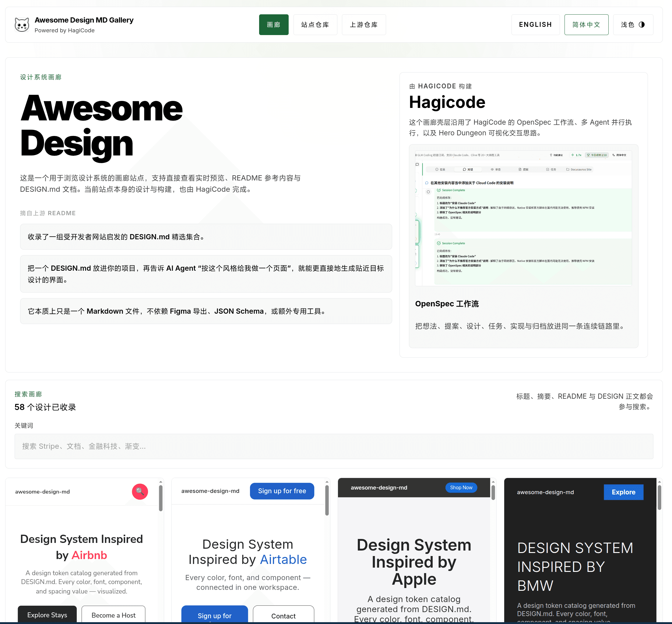
First, take a look at the final homepage. It brings together the design gallery entry point, the site repository, the upstream repository, and background information about HagiCode in a single interface, making it easy for the team to establish a shared context before diving into specific entries.
Analysis
Section titled “Analysis”Before writing code, let us break down the technical challenges behind this problem.
Source Content Management: How Do You Unify Scattered Design Resources?
Section titled “Source Content Management: How Do You Unify Scattered Design Resources?”The upstream awesome-design-md repository contains a large number of design documents, but we needed a way to bring them into our own project.
Solution: use git submodule
awesome-design-md-site└── vendor/awesome-design-md # Upstream resources (git submodule)This gives us several benefits:
- Version control: we can pin a specific upstream version
- Offline builds: no need to request external APIs during the build
- Content review: specific changes are visible in PRs
Data Normalization: How Do You Standardize Different Document Structures?
Section titled “Data Normalization: How Do You Standardize Different Document Structures?”Different companies structure their design documents differently. Some are missing preview files, and some use inconsistent naming. We need to normalize them during the build process.
Solution: scan and generate normalized entries at build time
The core module is awesomeDesignCatalog.ts, responsible for:
- Scanning the
vendor/awesome-design-md/design-md/*directory - Validating whether each entry contains the required files (
README.md,DESIGN.md, and at least one preview file) - Extracting and rendering Markdown content into HTML
- Generating normalized entry data
export interface DesignEntry {  slug: string;  title: string;  summary: string;  readmeHtml: string;  designHtml: string;  previewLight?: string;  previewDark?: string;  searchText: string;}
export async function scanSourceEntries() {  // Scan vendor/awesome-design-md/design-md/*  // Validate file completeness  // Generate normalized entries}
export async function normalizeDesignEntry(dir: string) {  // Extract README.md and DESIGN.md  // Parse preview files  // Render Markdown to HTML}
Static Site Architecture: How Do You Provide Dynamic Search While Staying Fully Static?
Section titled “Static Site Architecture: How Do You Provide Dynamic Search While Staying Fully Static?”Since this is a design gallery, search is a must-have. But Astro is a static site generator, so how do you implement real-time search?
Solution: React island + URL query parameter sync
export function SearchToolbar() {  const [query, setQuery] = useState('');
  // Sync with the URL  useEffect(() => {    const params = new URLSearchParams(window.location.search);    setQuery(params.get('q') || '');  }, []);
  // Filter in real time  const filtered = entries.filter(entry =>    entry.searchText.includes(query)  );
  return <input value={query} onChange={e => {    setQuery(e.target.value);    updateURL(e.target.value);  }} />;}
The advantage of this approach is that it keeps the deployability of a static site intact, meaning it can be deployed to any static hosting service, while still delivering an instant filtering experience.
Design Documentation: How Do You Help AI Understand and Follow Design Standards?
Section titled “Design Documentation: How Do You Help AI Understand and Follow Design Standards?”This is the core of the entire solution. We need to create a structured design.md that AI can understand and apply.
Solution: borrow the structure of ClickHouse DESIGN.md
ClickHouse’s DESIGN.md is an excellent reference. It includes:
- Visual Theme & Atmosphere
- Color Palette & Roles
- Typography Rules
- Component Stylings
- Layout Principles
- Depth & Elevation
- Do’s and Don’ts
- Responsive Behavior
- Agent Prompt Guide
Our approach is: reuse the structure, rewrite the content. We keep the section structure of ClickHouse DESIGN.md, but replace the content with the actual design tokens and component conventions used in our own project.
Solution
Section titled “Solution”Based on the analysis above, our solution consists of four core modules.
1. Content Ingestion Pipeline
Section titled “1. Content Ingestion Pipeline”This is the foundation of the whole system, responsible for extracting and normalizing content from upstream resources.
export async function scanSourceEntries(): Promise<DesignEntry[]> {  const designDir = 'vendor/awesome-design-md/design-md';  const entries: DesignEntry[] = [];
  for (const dir of await fs.readdir(designDir)) {    const entryPath = path.join(designDir, dir);    if (await isValidDesignEntry(entryPath)) {      const entry = await normalizeDesignEntry(entryPath);      entries.push(entry);    }  }
  return entries;}
async function isValidDesignEntry(dir: string): Promise<boolean> {  const requiredFiles = ['README.md', 'DESIGN.md'];  for (const file of requiredFiles) {    if (!(await fileExists(path.join(dir, file)))) {      return false;    }  }  return true;}
2. Gallery Browsing Interface
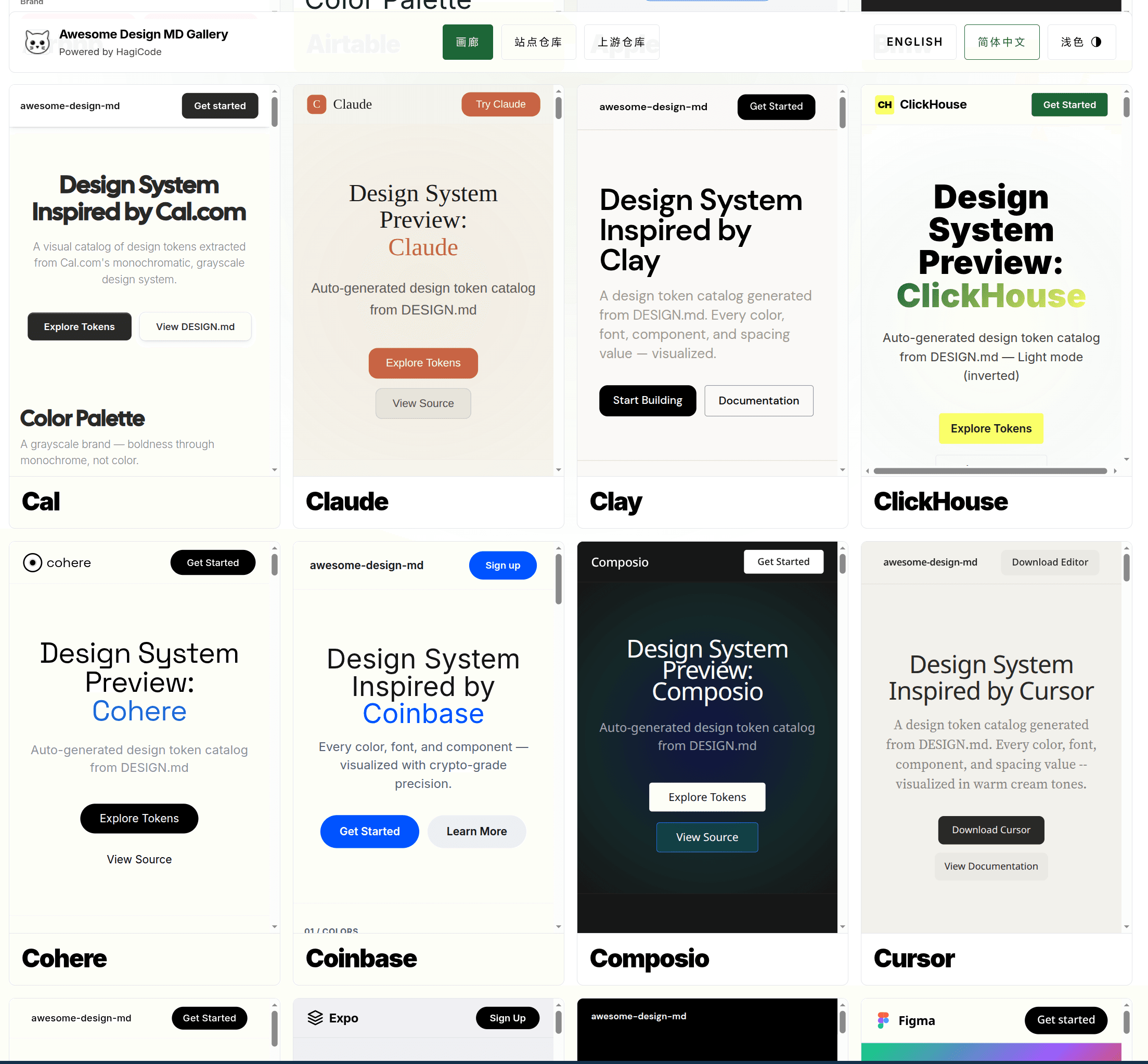
Section titled “2. Gallery Browsing Interface”The gallery interface includes three main parts:
Homepage: displays a card grid of all design entries, and each card includes:
- Design entry title and summary
- Preview image, if available
- Quick-search highlighting
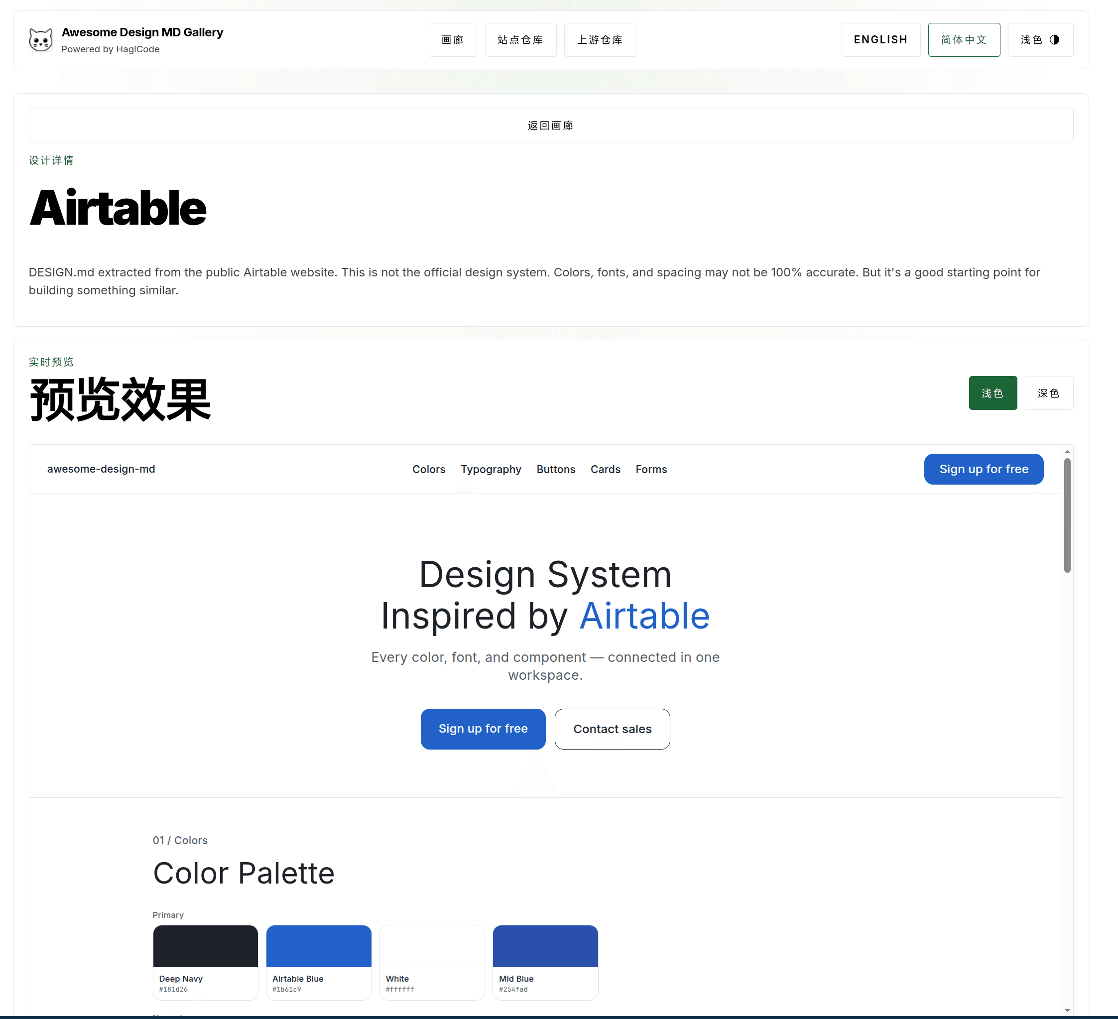
Detail page: aggregates the full information for a single design entry:
READMEdocumentDESIGNdocument- Preview with light/dark theme switching
- Navigation to adjacent entries
Navigation: supports returning to the gallery and browsing adjacent entries
The homepage gallery uses a high-density card layout, flattening design.md entries from different sources into a unified visual framework so that teams can quickly compare brand styles, button patterns, and typographic rhythm.
After opening a specific entry, the detail page places the design summary and live preview on the same page, reducing the cost of switching back and forth among documentation, previews, and source code.
3. Search Functionality
Section titled “3. Search Functionality”The search feature is based on client-side filtering, with state preserved through URL query parameters:
function SearchToolbar({ entries }: { entries: DesignEntry[] }) {  const [query, setQuery] = useState('');  const [results, setResults] = useState(entries);
  useEffect(() => {    const params = new URLSearchParams(window.location.search);    const initialQuery = params.get('q') || '';    setQuery(initialQuery);    filterEntries(initialQuery);  }, []);
  const filterEntries = (searchQuery: string) => {    const filtered = entries.filter(entry =>      entry.searchText.toLowerCase().includes(searchQuery.toLowerCase())    );    setResults(filtered);  };
  const handleChange = (e: React.ChangeEvent<HTMLInputElement>) => {    const value = e.target.value;    setQuery(value);    filterEntries(value);
    // Update the URL without triggering a page refresh    const newUrl = value      ? `${window.location.pathname}?q=${encodeURIComponent(value)}`      : window.location.pathname;    window.history.replaceState({}, '', newUrl);  };
  return (    <div className="search-toolbar">      <input        type="text"        value={query}        onChange={handleChange}        placeholder="Search design entries..."      />      <span className="result-count">{results.length} results</span>    </div>  );}
4. Design Reference Document (design.md)
Section titled “4. Design Reference Document (design.md)”This is the core deliverable of the whole solution. We create a design.md in the project root with the following structure:
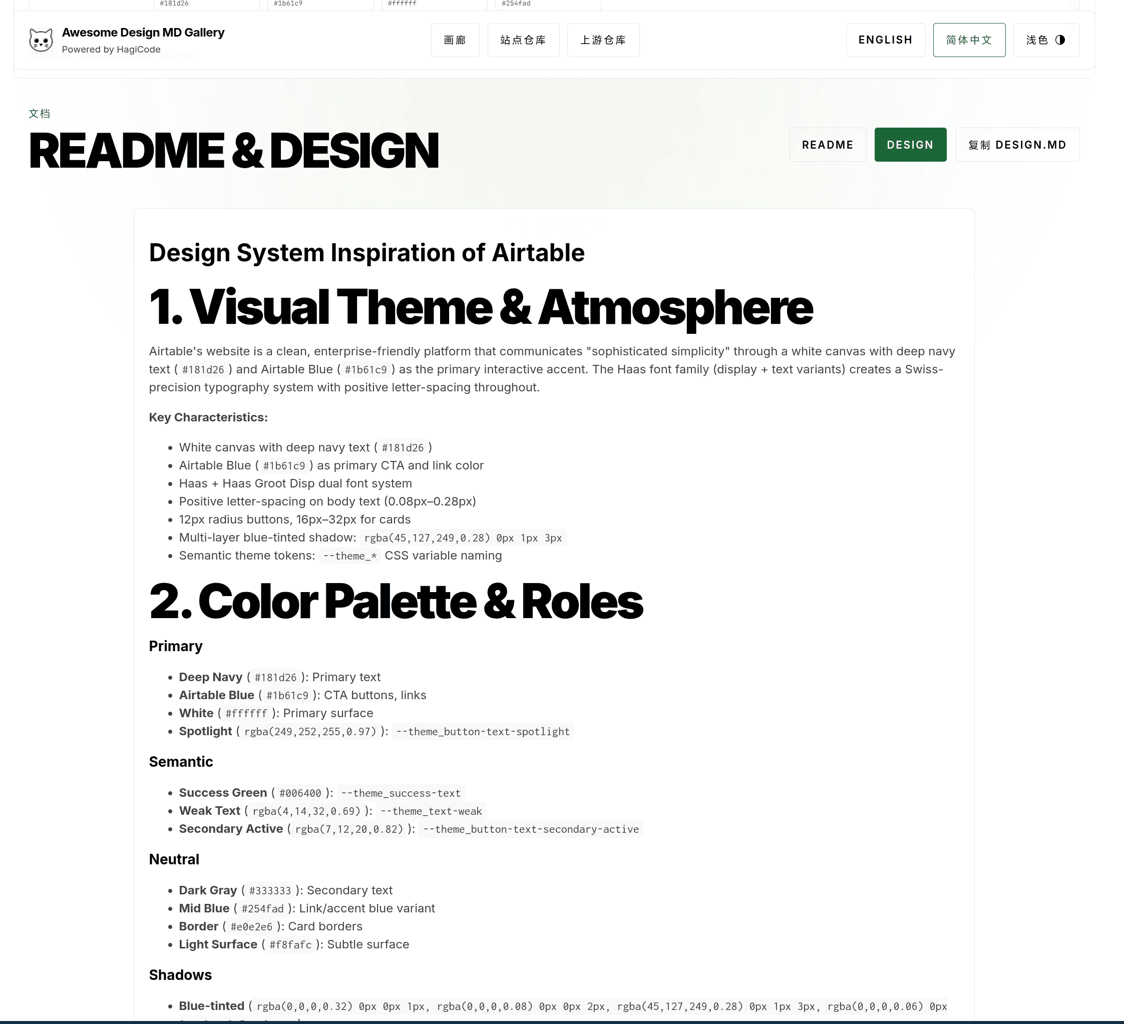
In addition to the raw design.md content consumed by AI, we also place both the README and DESIGN documents into the same reading interface, making it easier for people to proofread, copy snippets, and compare them against the preview results.
# Design Reference for [Project Name]
## 1. Visual Theme & Atmosphere- Overall style description- Design philosophy and principles
## 2. Color Palette & Roles- Primary and supporting colors- Semantic colors (`success`, `warning`, `error`)- CSS variable definitions
## 3. Typography Rules- Font families- Type scale (`h1-h6`, `body`, `small`)- Line height and font weight
## 4. Component Stylings- Button style conventions- Form component styles- Card and container styles
## 5. Layout Principles- Spacing system- Grid and breakpoints- Alignment principles
## 6. Depth & Elevation- Shadow levels- `z-index` conventions
## 7. Do's and Don'ts- Common mistakes and correct approaches
## 8. Responsive Behavior- Breakpoint definitions- Responsive adaptation rules
## 9. Agent Prompt Guide- How to use this document in AI prompts- Example prompt templates
Practice
Section titled “Practice”Now that we have covered the solution, how do you actually implement it?
Implementation Steps
Section titled “Implementation Steps”Step 1: Initialize the submodule
# Add the upstream repository as a submodulegit submodule add https://github.com/VoltAgent/awesome-design-md.git vendor/awesome-design-md
# Initialize and update the submodulegit submodule update --init --recursive
Step 2: Create the content pipeline
Implement awesomeDesignCatalog.ts, including:
- File scanning and validation logic
- Markdown rendering using Astro’s built-in renderer
- Entry data extraction
Step 3: Build the gallery UI
Use Astro + React Islands to create:
- Homepage gallery layout (card grid)
- Design card components
- Search toolbar
- Detail page layout
Step 4: Write the design document
Based on the structure of ClickHouse DESIGN.md, fill in the actual design tokens from your own project. Update README.md and add a link to design.md.
Security: Markdown rendering requires filtering unsafe HTML. Astro’s built-in renderer filters script tags by default, but you still need to watch for XSS risks.
Performance: A large number of iframe previews may affect first-paint performance. It is recommended to use loading="lazy" to lazy-load preview content.
Maintainability: design.md needs to stay in sync with the code implementation. It is recommended to add CI checks to ensure that CSS variables remain consistent between documentation and code.
Accessibility: Make sure color contrast meets the WCAG AA standard (at least 4.5:1).
AI Usage Guide
Section titled “AI Usage Guide”After creating design.md, how do you get AI to actually use it? Here are a few practical tips:
Tip 1: Reference it explicitly in the prompt
Please refer to the design.md file in the project root and use the design conventions defined there to implement the following components:- Buttons: use the primary color with an 8px border radius- Cards: use the elevation-2 shadow levelTip 2: Require AI to reference specific CSS variables
Implement a navigation bar with the following requirements:- Use --color-bg-primary for the background color- Use --color-border-subtle for borders- Use --text-color-primary for textTip 3: Include design.md content in the system prompt
If your AI tool supports custom system prompts, you can add the core content of design.md directly to it.
Testing Strategy
Section titled “Testing Strategy”Content pipeline testing:
- Missing-file scenarios (missing
README.mdorDESIGN.md) - Format error scenarios (Markdown parsing failure)
- Empty-directory scenarios
Search feature testing:
- Empty result handling
- Special characters such as Chinese and emoji
- URL sync verification
UI component testing:
- Light/dark theme switching
- Responsive layout
- Preview loading states
Deployment Workflow
Section titled “Deployment Workflow”# 1. Update the submodule to the latest versiongit submodule update --remote
# 2. Rebuild the sitenpm run build
# 3. Deploy static assetsnpm run deployIt is recommended to automate submodule updates plus build and deployment, so that CI can be triggered automatically whenever the upstream repository is updated.
Conclusion
Section titled “Conclusion”The inconsistency in AI-generated UIs that HagiCode encountered during development was, at its core, caused by the lack of a structured design reference document. By building a design gallery site and creating a standardized design.md, we successfully solved this problem.
The core value of this solution lies in:
- Unified resources: consolidating scattered design system documentation
- Structured standards: expressing design conventions in a format AI can understand
- Continuous maintenance: keeping content up to date through
git submodule
If you are also using AI for frontend development, this approach is worth trying. Creating a structured design.md not only improves the consistency of AI-generated code, but also helps your team maintain unified design standards internally.
References
Section titled “References”- VoltAgent/awesome-design-md - Collection of design system documentation
- ClickHouse DESIGN.md - Reference structure for design documentation
- Astro Official Documentation - Static site generation framework
- HagiCode source code - Production implementation of this solution
If this article helped you:
- Give it a like so more people can find it
- Give us a Star on GitHub: github.com/HagiCode-org/site
- Visit the official website to learn more: hagicode.com
- Watch the 30-minute live demo: www.bilibili.com/video/BV1pirZBuEzq/
- Install with one click: docs.hagicode.com/installation/docker-compose
- Quick install for Desktop: hagicode.com/desktop/
- The public beta has started, and you are welcome to try it
Copyright Notice
Section titled “Copyright Notice”Thank you for reading. If you found this article useful, feel free to like, save, and share it. This content was created with AI-assisted collaboration, and the final content was reviewed and approved by the author.
- Author: newbe36524
- Original article: https://docs.hagicode.com/blog/2026-04-08-design-md-consistent-ui/
- License: Unless otherwise noted, all blog posts on this site are published under the BY-NC-SA license. Please include attribution when reposting.